Overview
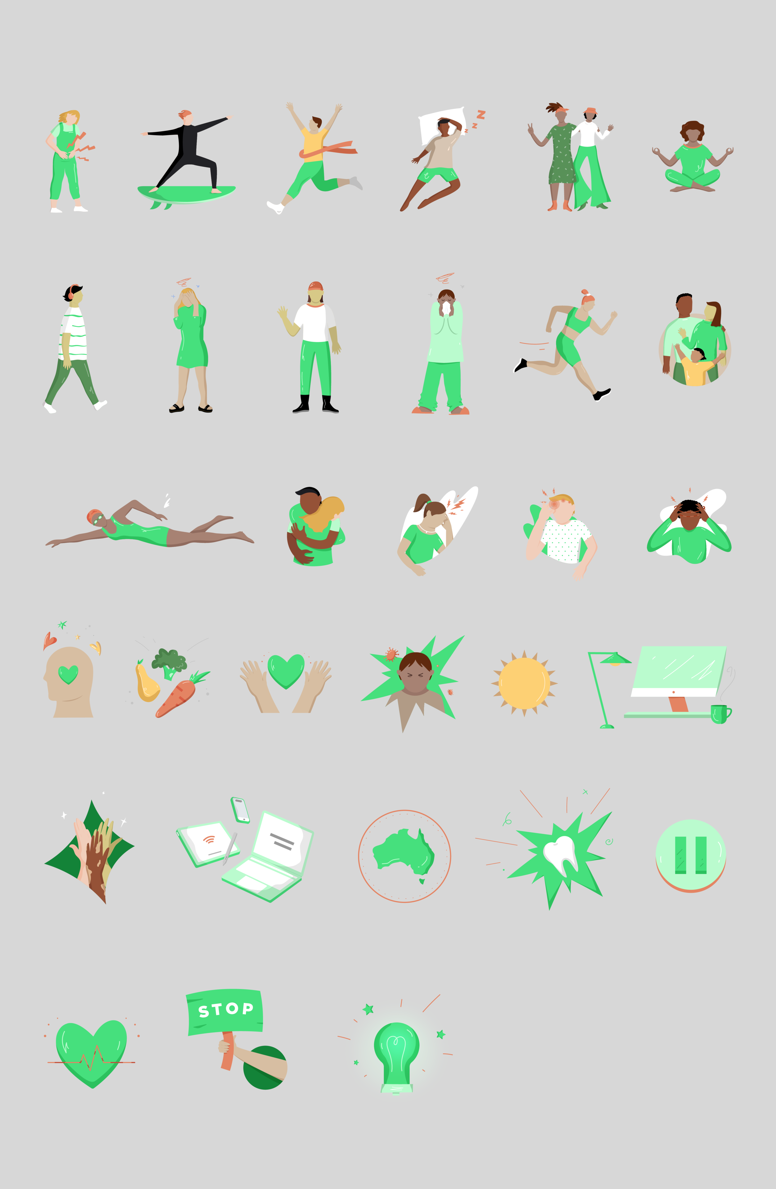
GSK Panadol came to the team with a task in mind: refresh their digital iconography library. We started with a general investigation on all assets used on their website, listing, identifying inconsistencies (some icons had different use of strokes and shapes) and exploring how we could create a more uniform look and feel. I started sketching and drawing one single element (the girl in the yoga pose) in order to offer different options with different visual approaches, infusing an extension of their actual colour palettes while maintaining a graphic technique that resembles the graphic elements that the brand already have. What started as an icon brief organically became, in its core, an illustration request, as Panadol wanted assets that could be used primarily on social media branching out into their other digital platforms.


